
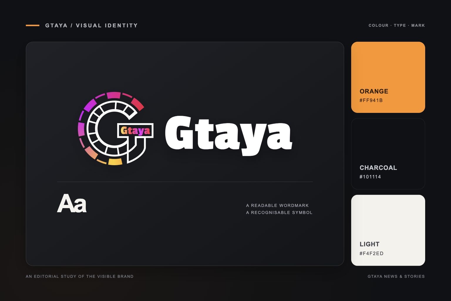
The GTAYA public website has a recognisable visual vocabulary: a dark background, a light wordmark and orange accents. Its G-shaped emblem sits beside the brand name, giving the identity both a compact symbol and a readable name.
This article describes those visible elements. It does not assign an unpublished history or meaning to the logo, and it does not treat a design observation as a statement about company performance.
A symbol and a readable name
The emblem uses a G-shaped arrangement of outlined segments with several colour accents. The adjacent GTAYA wordmark provides the name in a strong, light treatment. Together, the two parts can be recognised at different sizes: a compact header can retain the symbol and name, while a larger brand panel can give them more space.
The information website uses the existing logo asset rather than introducing a second emblem. That choice keeps the brand reference consistent across the header, article pages and footer.
Dark surfaces and orange emphasis
Charcoal and near-black surfaces provide the base for the web presentation. Orange is used more selectively around active navigation, links and headings. Light text separates page content from its background, while softer grey text carries dates and other secondary information.
On these information pages, the same palette is applied to category controls, article cards and navigation. The layout is allowed to change with screen width; the name, colour treatment and basic hierarchy remain consistent.
Editorial images have a separate role
Article illustrations support the subject of a page. They are distinct from the brand logo and should not be read as photographs of GTAYA facilities, staff or events. A cover image can introduce a topic, while the title and text explain the actual information being published.
The result is a single brand identity used across several editorial formats, with the logo identifying GTAYA and the page structure helping readers understand each item.